

The State of Michigan has not updated its brand identity in a couple of decades now.
Focused my design intent on the beauty and joy of the lakes, keeping it friendly, laid back, and recreational.
Project scope included a flag redesign.
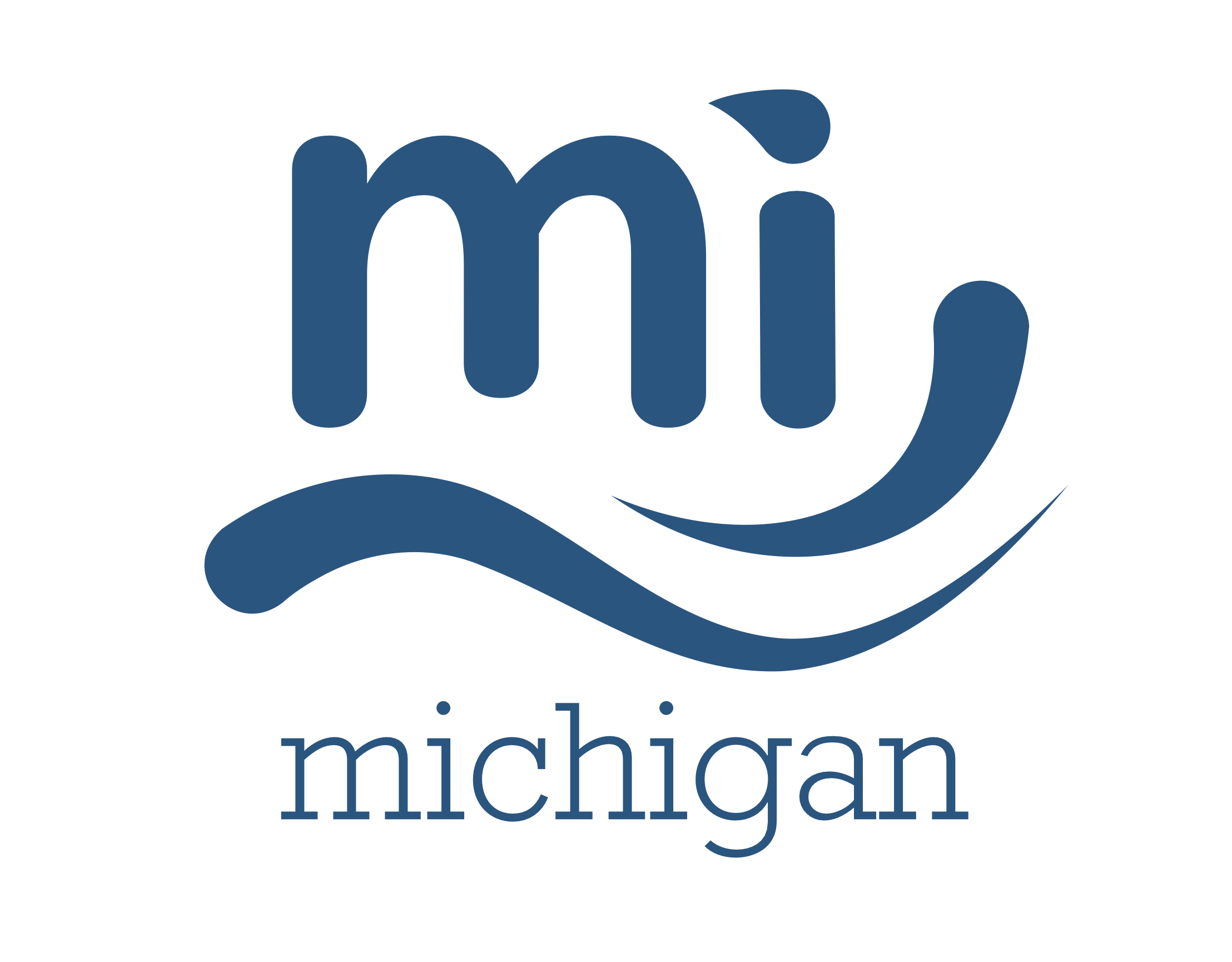
The finished brand mark including the lettermark and wordmark. I wanted to create a flowing, fresh design that felt friendly and clean.

The main blue chosen for the brand color was picked from a personal photograph of Lake Michigan. White as the secondary color allows for clear contrast and accessibility.
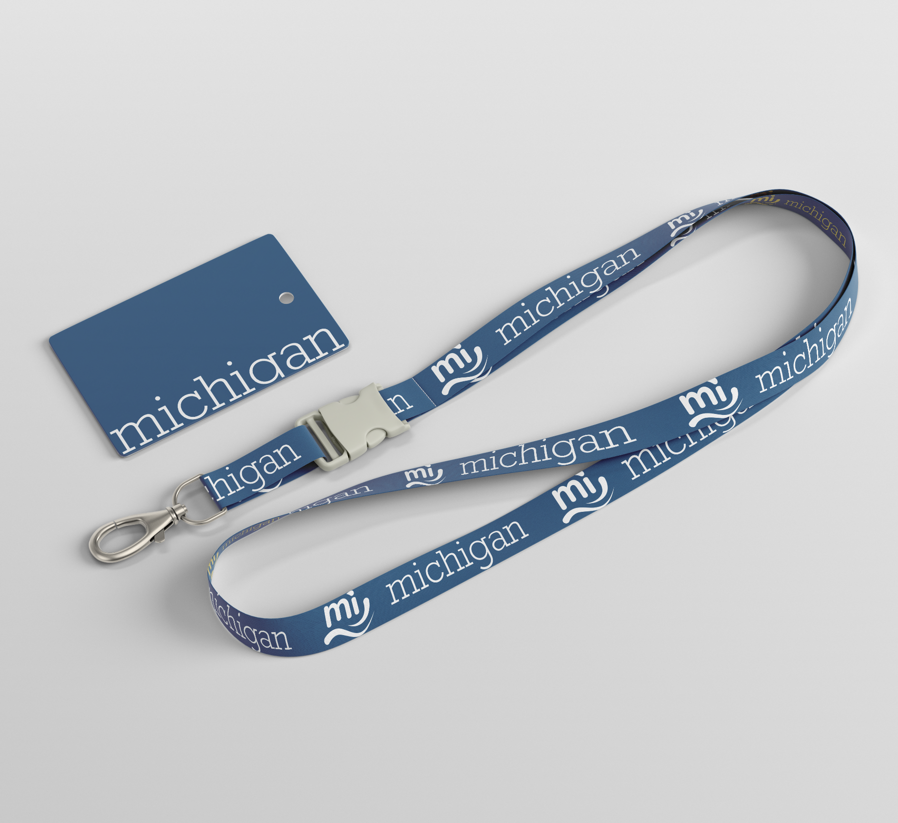
Product mockups were a big part of the project, just to see how it would apply in day to day life.
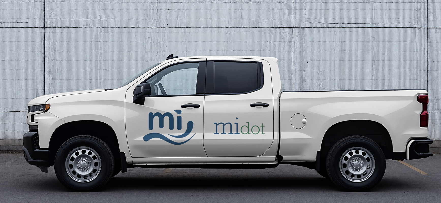
Department of Transportation doesn't need to be boring. Adding in the tertiary green allows the design some flexibility, green for land, blue for water.
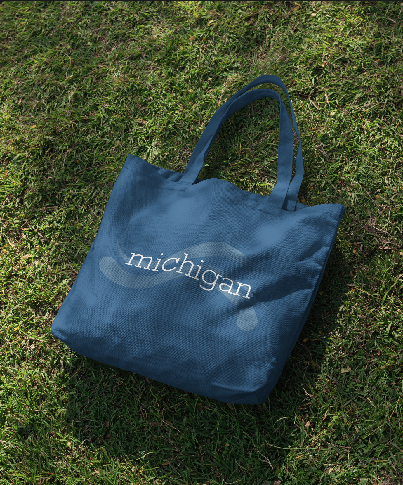
One of my personal favorite designs with the flourish in the background with the wordmark in the center.
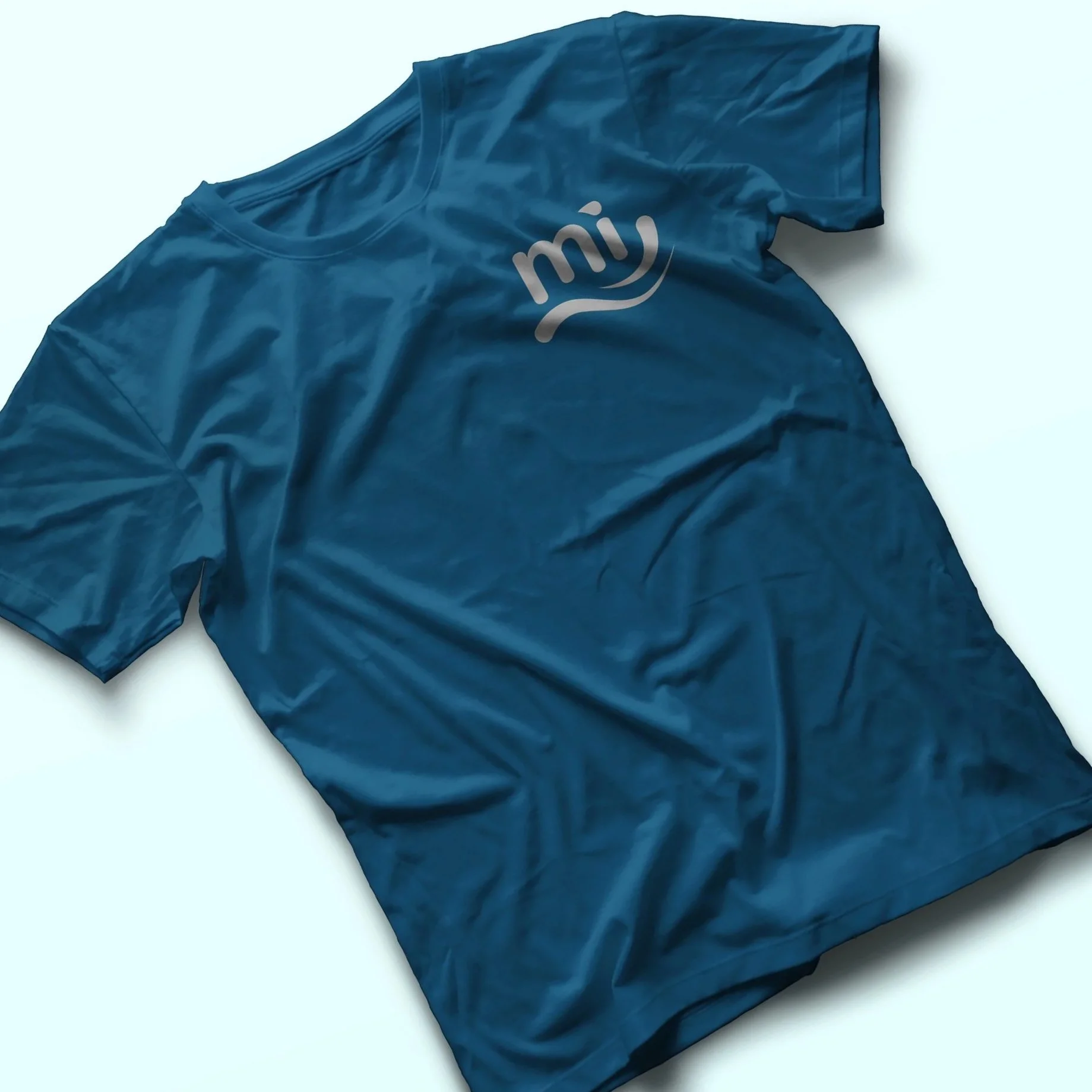
When I designed these shirts, my family (all Michiganders) asked if it was something that we could make. Stay tuned!
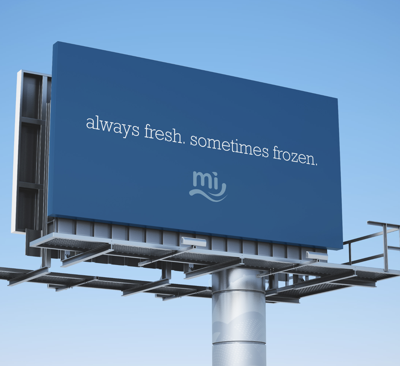
Billboards that announce the new branding have fun, common sayings around the state. Always fresh, sometimes frozen refers to the state of the Great Lakes.
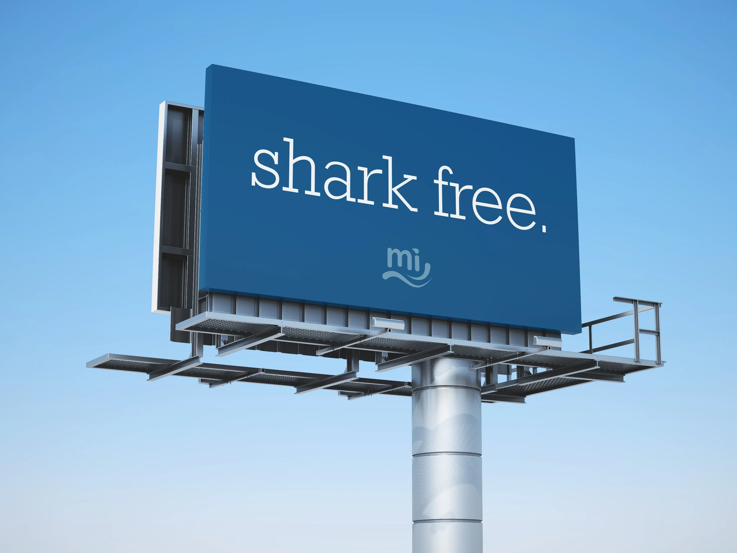
Unlike the oceans, we don't have sharks in Michigan.
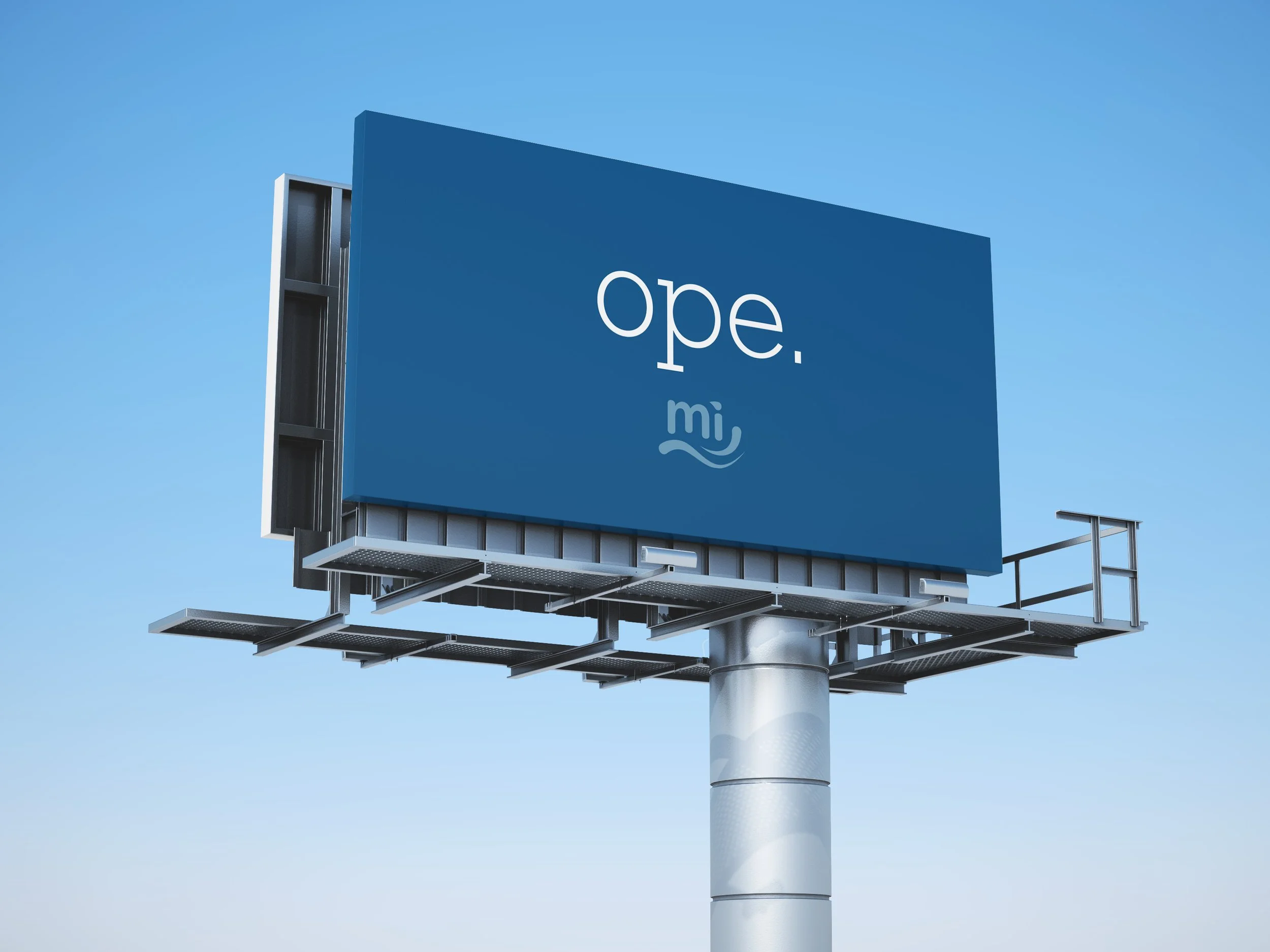
Every midwesterner knows 'ope', and in Michigan, it's used as an identifier.
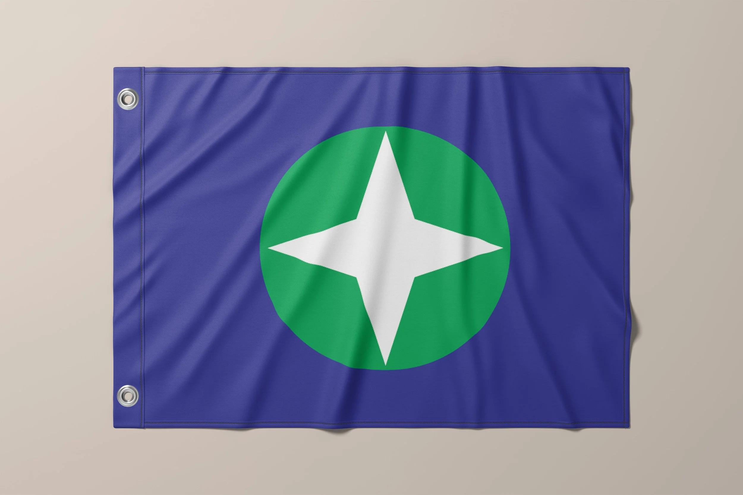
The flag design features blue, green, and the four pointed star arranged purposely. The center design is both the land surrounded by the blue lakes and a compass as a tribute to all of the sailors who brave the waters.
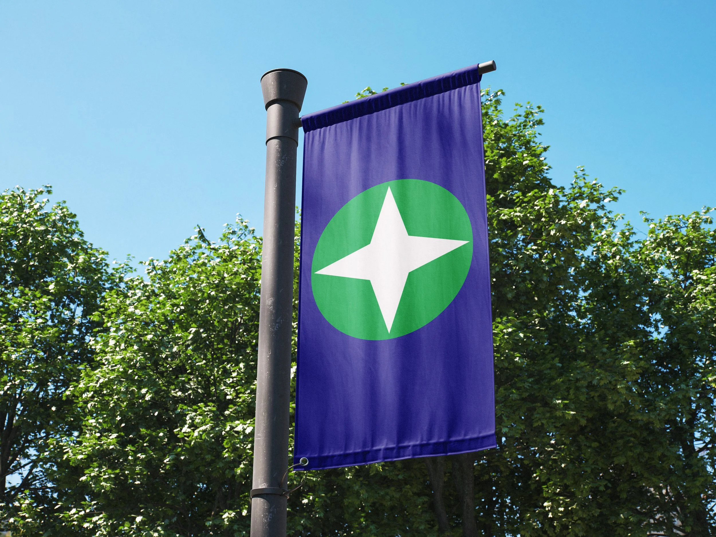
Featuring the state flag is not a huge part of the Michigan identity currently, because the design is not particularly good. This simple, clean design could be a fresh and proud way to display the love for America's High Five; the Mitten State.