
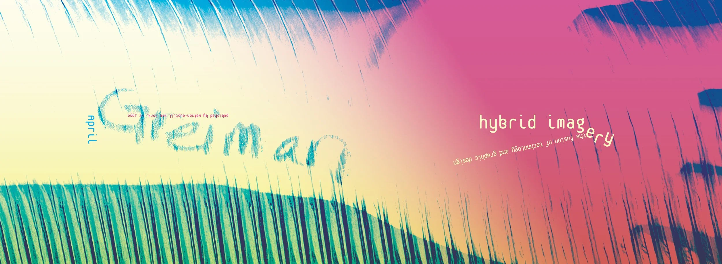
Redesign for the cover and front matter of April German’s Hybrid Imagery
I used my own body as tribute to her work, writing her name on my arm and scanning it for the cover, additionally used a digital photograph of my fence photoshopped with effects.
Color was made to reflect the early era of the digital and traditional mediums combining, but keeping a modern flair while being bold.
cover photo by Nolwen Cifuentes
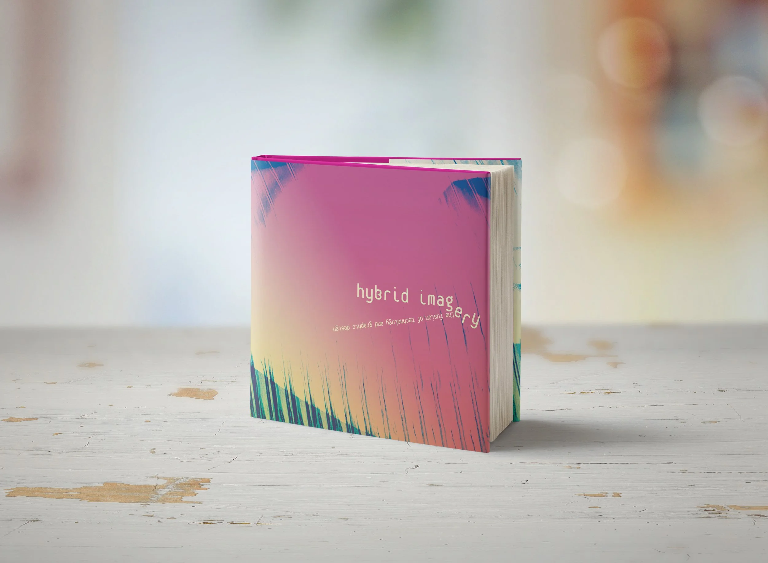
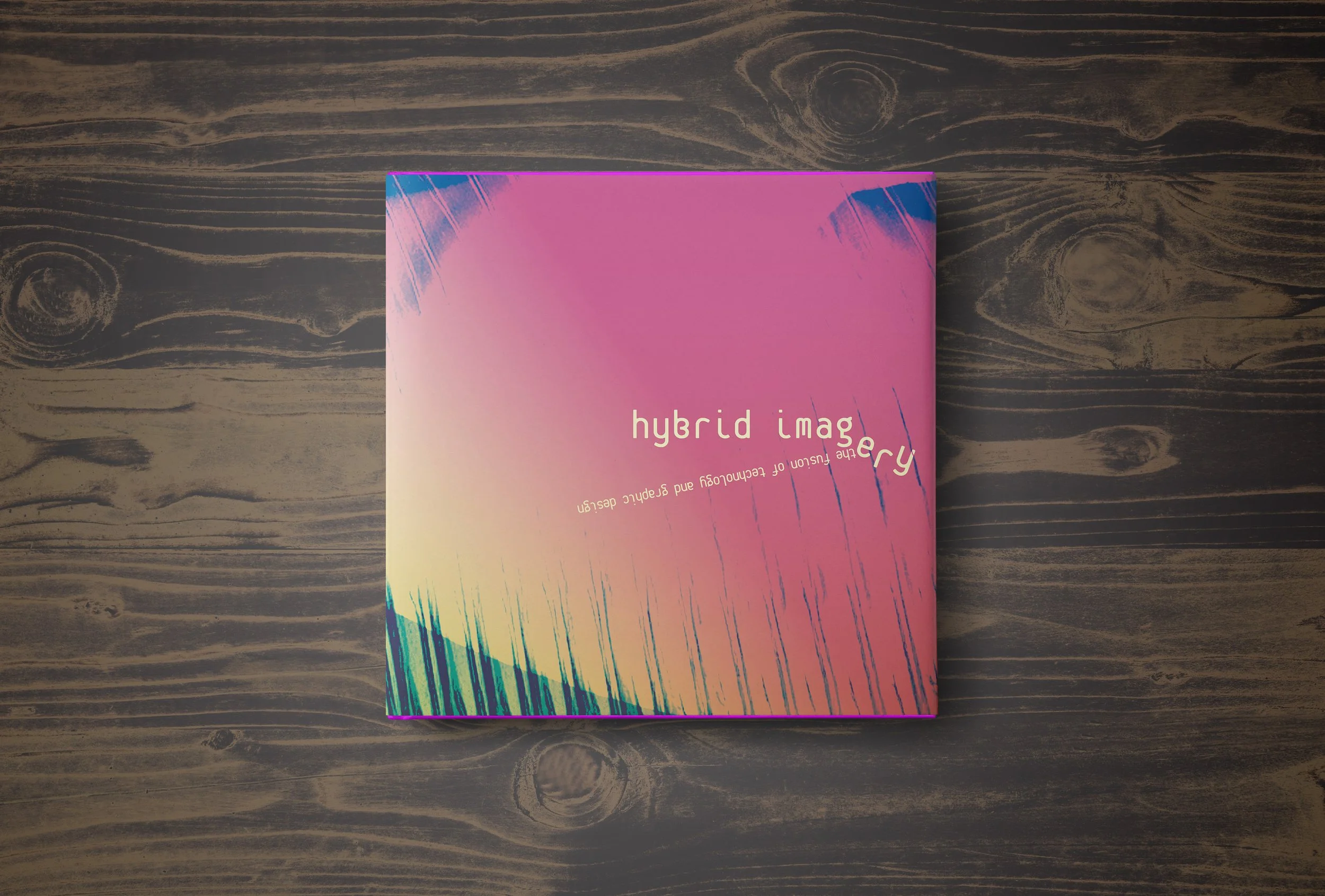
The finished cover with the pink side facing up. The dust jacket has a little fun with the typography, knocking letters around and combining both digital and traditional mediums.
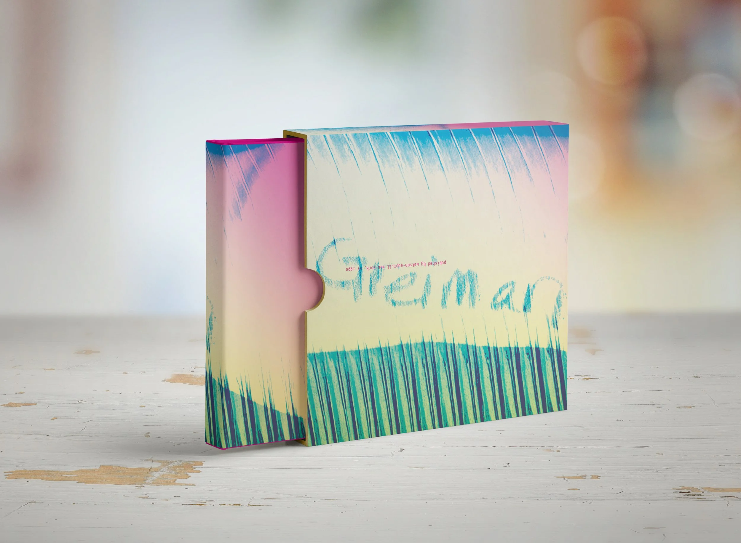
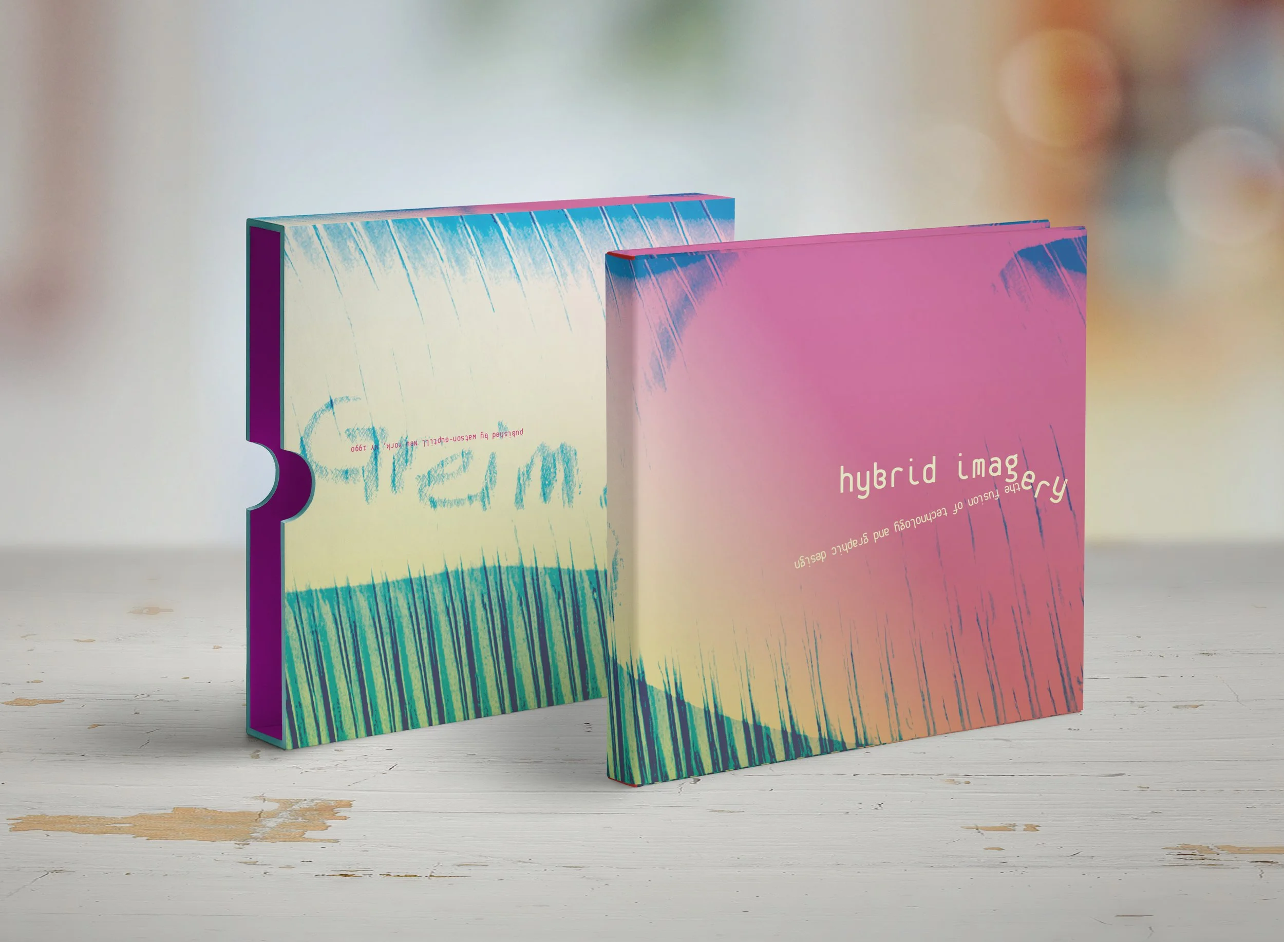
The protective sleeve features the back of the book on this side.
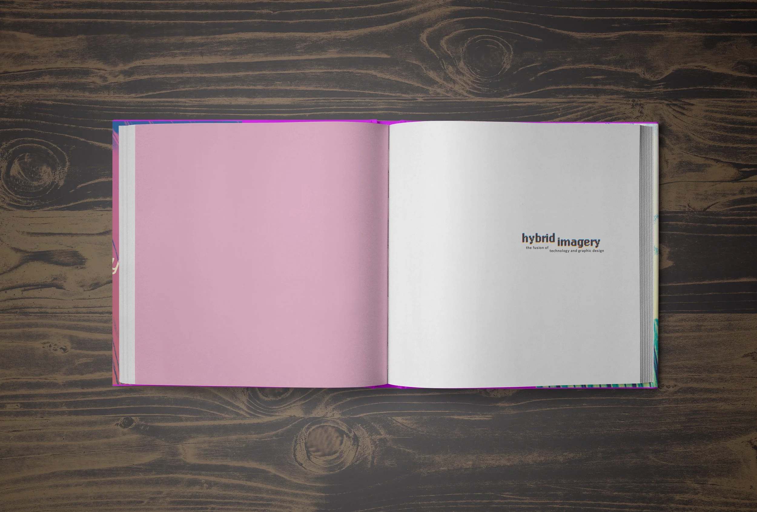
I chose lo-res as a header typeface for the front matter as nostalgia for the era of early digital.
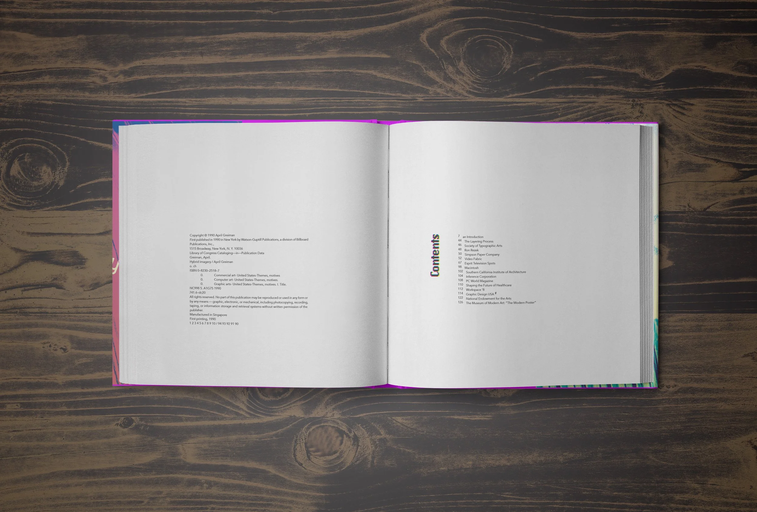
The hang line is fairly low, and I wanted to continue to have fun with the typography by keeping things on its side on occasion.
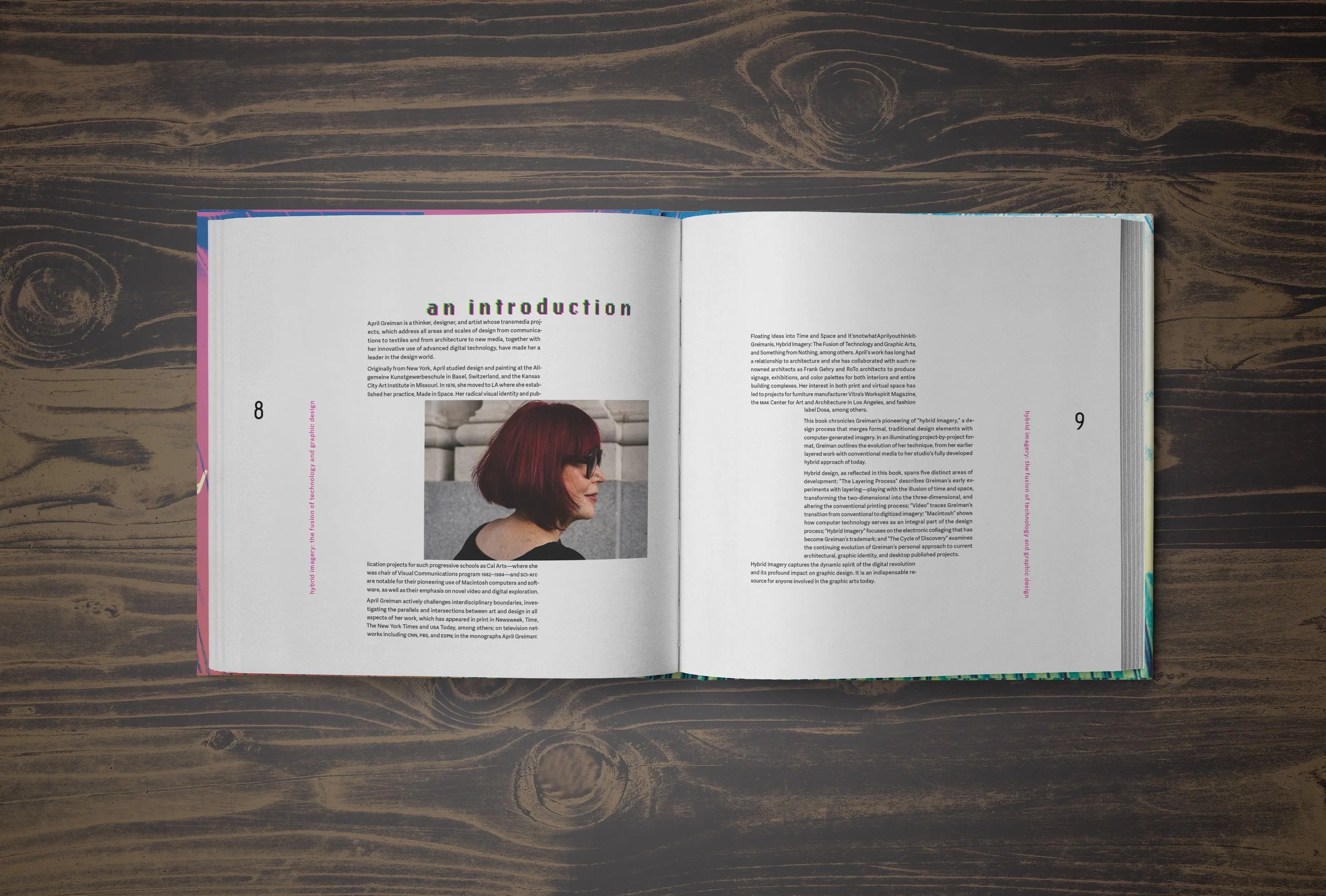
The introduction page. I made the choice to knock the image (which was placed on the hang line to reinforce it) out as a symbol of April breaking the norm and making her own rules.
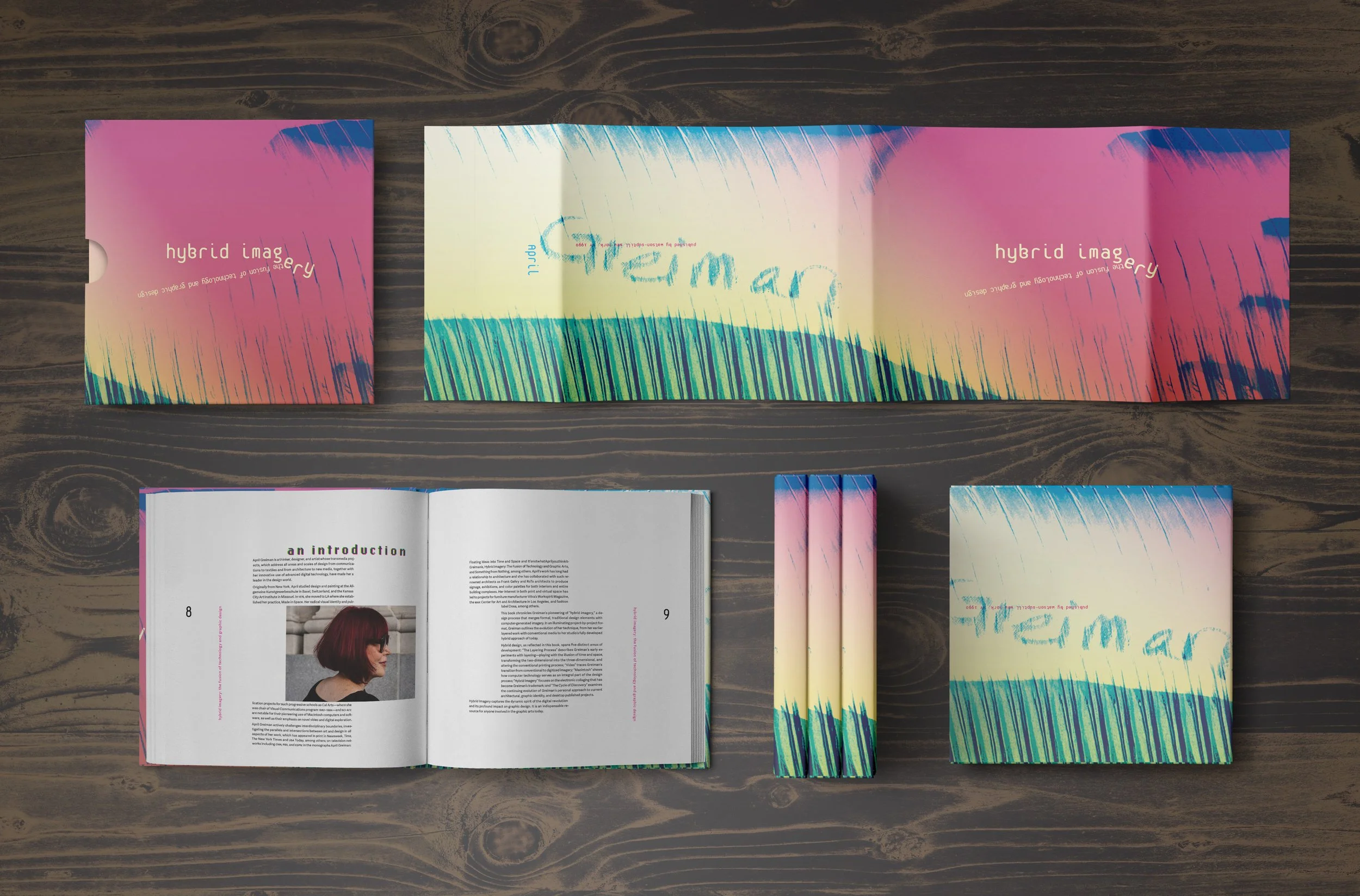
A full spread of the mockups and featuring the introduction spread, my personal favorite.